

Supabase UI Library
Drop-in components based on shadcn/ui & powered by Supabase
About
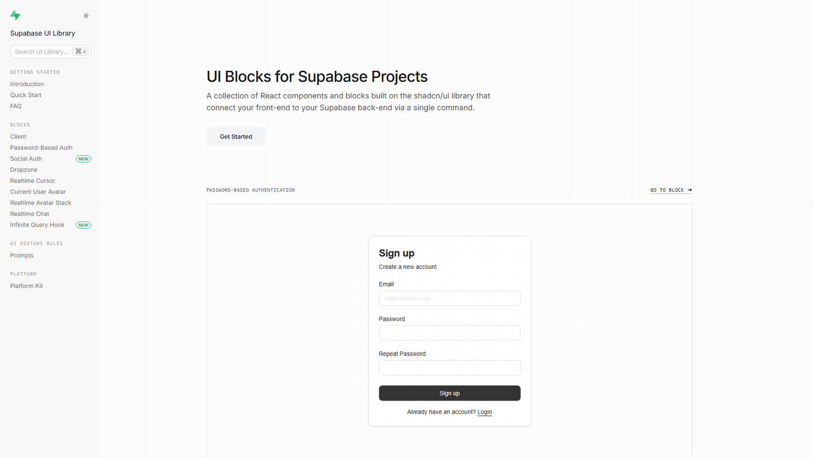
The Supabase UI Library is a collection of React components and blocks built on the shadcn/ui library. These components are designed to connect the front-end of an application to a Supabase back-end via a single command, offering ready-to-use blocks for features like password-based authentication, social authentication, real-time cursors, file upload, current user avatar, real-time avatar stack, and real-time chat.
Categories & Tags
Color Palette
Background White
#FFFFFF
Text Dark Grey
#333333
Link Blue
#0070F3
Accent Green
#22C55E
Typography
Sans-serif
General text, headings, and UI elements
Design Review
Similar Products

Clear for Slack
Clear messages get answered quicker

Griply 2026
Achieve your goals with a goal-oriented task manager

HappyMail
We made email simple again

Blober.io
The easiest way to transfer files between cloud providers.

Supaguard
Scan, Detect & Protect Your Supabase Data

Timelines Time Tracking 4
Track your time to achieve your New Year resolutions.
SoftReveal — Reveal less. Engage more.
Hide Content, Reveal on Click

CalPal
The notebook calculator that thinks for you (now with AI).

Reword
Rewrite messages without leaving your workflow

Radial
Your shortcuts, one gesture away

MoovAI
Launch viral AI ads & pro social content in minutes

Resell AI
Reselling workflow with market-based price suggestions